1.858.217.5144
Start your project

Making Your PowerPoint Accessible for the Visually Impaired
Power Point Tips
visual impaired
May 01, 2015
Ensuring that your PowerPoint presentations are accessible to everyone, including individuals with visual impairments, is critical for creating inclusive content. By following best practices for accessibility, you can make your presentations more usable for a wider audience, improving their overall impact. Here are some key strategies for making your PowerPoint accessible to the visually impaired.
1. Use High Contrast Colors
One of the easiest ways to improve accessibility is by using high-contrast colors for text and background elements. This ensures that people with low vision or color blindness can easily read the content.
Why It’s Important :
- Improves Readability : High contrast makes text easier to read for people with visual impairments.
- Enhances Visual Clarity : Clear distinctions between text and background colors help improve comprehension.
How to Do It :
- Choose a light background with dark text, or a dark background with light text.
- Use PowerPoint’s built-in Accessibility Checker to identify areas where contrast may need improvement.
2. Provide Alt Text for Images
Adding alternative (alt) text to images allows screen readers to describe visual elements to visually impaired users. This is essential for ensuring that your images and graphs are accessible.
- Enhances Understanding : Alt text gives visually impaired users context for the images they cannot see.
- Complies with Accessibility Standards : Providing alt text ensures that your presentation meets basic accessibility guidelines.
- Right-click on an image, select Edit Alt Text , and provide a concise description of the image.
- Ensure that alt text conveys the meaning of the image, not just a literal description (e.g., “A chart showing sales growth” instead of “Chart”).
3. Use Descriptive Hyperlinks
Hyperlinks are often used to link to external resources, but vague text like “click here” can be confusing for screen readers. Descriptive hyperlinks provide more context and clarity for all users.
- Provides Clarity : Descriptive hyperlinks help visually impaired users understand where a link will take them.
- Improves Navigation : Clear hyperlink text helps screen reader users navigate more easily through the content.
- Instead of using generic phrases like “click here,” use descriptive text such as “Download the full report.”
- Right-click the hyperlink, choose Edit Link , and modify the text to make it more descriptive.
4. Use Large, Readable Fonts
Choosing fonts that are easy to read is crucial for accessibility. Avoid decorative fonts, and make sure your text is large enough to be legible to those with low vision.
- Improves Readability : Large, clear fonts help ensure that people with visual impairments can read the content.
- Increases Accessibility : Readable fonts make your presentation more accessible to a wider audience.
- Use sans-serif fonts like Arial, Calibri, or Verdana, which are easier to read on screens.
- Keep the font size at least 18pt for body text and 24pt for headings to ensure readability.
5. Avoid Using Only Color to Convey Information
Relying solely on color to communicate meaning can be problematic for individuals with color blindness. Instead, use patterns, text labels, or icons in addition to color to convey important information.
- Ensures Information is Clear : People with color blindness may not be able to distinguish between certain colors, so using other visual cues ensures they can understand the content.
- Improves Data Accessibility : Adding text labels or patterns to charts and graphs ensures that all users can interpret the information.
- Use text labels on charts and graphs to describe data points.
- Consider adding patterns or textures to differentiate between elements in diagrams or graphs.
6. Make Content Navigable with a Keyboard
Some visually impaired users may rely on keyboards, rather than a mouse, to navigate through presentations. Ensuring that your PowerPoint is fully navigable via keyboard improves accessibility.
- Increases Usability : Keyboard navigation is essential for users who may not be able to use a mouse.
- Meets Accessibility Standards : Supporting keyboard shortcuts makes your presentation more inclusive and compliant with accessibility guidelines.
- Test your presentation by navigating using only the keyboard (e.g., using the Tab key to move between elements).
- Ensure that key features like buttons, hyperlinks, and text boxes are accessible without a mouse.
7. Use Accessible Templates
PowerPoint offers a range of templates, but not all of them are designed with accessibility in mind. Choosing an accessible template ensures that your presentation is easy to navigate and understand.
- Simplifies Accessibility : Using a template that’s designed for accessibility reduces the amount of manual work required to meet accessibility standards.
- Improves Layout Consistency : Accessible templates help maintain a clean, organized structure, making your presentation easier to follow.
- When creating a new presentation, select an accessible template from PowerPoint’s library.
- Ensure that the template includes high contrast, large fonts, and simple layouts.
Final Thoughts
Making your PowerPoint presentations accessible to visually impaired users is essential for creating an inclusive and effective communication tool. By using high contrast colors, providing alt text for images, and ensuring keyboard navigation, you can make your presentations accessible to a broader audience. Remember, accessibility isn’t just a requirement—it’s an opportunity to make your message more impactful for everyone.
Other popular articles
Designing an investor-ready ‘use of funds’ slide for ai startups.
October 26, 2024
Do Non-Technical Audiences Benefit from Visual Presentations?
October 25, 2024
Expertise on Display: ‘Who We Are’ Slide for Fintech
October 24, 2024
Save Time by Outsourcing Conference Presentations
October 23, 2024
Visualize a Product Launch ‘Timeline’ Slide for Clear Project Phases
October 22, 2024
Mistakes to Avoid on a ‘Patent’ Slide in Consumer Electronics Pitch Deck
October 21, 2024
24×7 Design Services

- Face to Face Disability Awareness Training
- Virtual disability awareness training
- Lunch and learn
- Tailored Disability awareness e-Learning
- Access audits
- British Sign Language
- BSL for your website
- Deaf awareness
- Testimonials
- Work Experience
- Myth Busters
- Helpful blogs
- Law and Policy
- Free Resources
Creating Accessible Powerpoint Presentations
This guide outlines best practice for creating accessible PowerPoint presentations. In the UK around 2 million people have sight loss. A visual impairment could be sensitivity to light, blurred vision or blindness. So please don’t think that because you don’t have a colleague with a guide dog that this isn’t relevant to you. It is! Video calling and webinars are the new norm so accessibility should be a priority rather than an afterthought.
Imagine presenting to an audience, or at a job interview only to discover those you need to impress can’t understand your slides. It’s not a good first impression, especially if equality and inclusion are values your employer actively promotes.
Good Practice
Lots of people who are visually impaired will be able to read your slides without using any specialist software IF you make some subtle and simple changes. Use these points when creating accessible PowerPoint presentations.
- Use PowerPoint’s inbuilt accessibility checker. It’s super easy to use and will quickly highlight accessibility issues.
- Have a sufficient colour contrast between the text and the background so that people with low vision can see the content. A dark font on a light background often works best and avoid a pure white background.
- Choose your fonts carefully. Sans Serif typeface is best and should be font size 24 or above (larger for titles).

- Some people will find reading italic and underlined text difficult so keep these to a minimum if you must use them.
- Make sure that you are not using colour alone to convey information. It can be useful to select greyscale from the view tab and scan your slides for occurrences of colour coding.
- Avoid busy backgrounds and keep ample ‘white space’ between sentences and paragraphs.
- Avoid using animations and sounds if it’s not vital to the presentation because they are distracting.
More Insights
Whilst not exhaustive these tips are a good starting point. Every month we add new articles to this site ranging from ‘How To’ practical instructions to insightful interviews.
Please contact us if you’d like to chat about working together to make your organisation accessible for all. We offer accessibility audits, disability awareness training, British Sign Language Lessons and much more.
You may also enjoy these articles:
12 Tips for Accessible Video Calls
Video Conferencing with Deaf Colleagues
What is A Hidden Disability
Join us on twitter @EnhanceTheUK for more practical tips on disability awareness and making your working environment inclusive for all.
Related Posts

How to book a British Sign Language (BSL) interpreter

Festivals and accessibility: top tips from the Enhance the UK team

9 technology changes that can support D/deaf colleagues or those with hearing loss
GOV.WALES uses cookies which are essential for the site to work. Non-essential cookies are also used to tailor and improve services. By continuing to use this site, you agree to our use of cookies.

How to create accessible PowerPoint presentations
Instructions for improving the accessibility of PowerPoint presentations.
- Create accessible documents and
- GOV.WALES standards and guidance (Sub-topic)
Arrange slides correctly
Put your slide content in a proper reading order so that screen reading software can read it aloud correctly for users with a visual impairment.
Reading order
To set the reading order, click on Home > Arrange > Selection Pane.
List objects in the slide in a logical order so that any screen reading software reads them aloud in the right order.
To rearrange objects into a new reading order, either drag the object into a new location or click on it and select Bring Forward or Send Backward.
To check the reading order, select a slide and press the Tab key. Each time you press the key, the focus moves to the next object that a screen reader will read.
Improve image accessibility
How to make the charts, graphs, and images in your PowerPoint slides accessible to users with visual or cognitive disabilities.
To make images more accessible:
- use colour, text, patterns, or shapes to communicate ideas
- add descriptive Alt Text to pictures, charts, and other visual objects
- group layered images, like a picture with callout lines, into a single object
- select View > Grayscale, to get an idea how your slides might look to someone with colour vision deficiency
Add Alt Text to a chart
- Highlight the chart by clicking on it.
- Right-click the chart and select Format Chart Area.
- Select Size & Properties > Alt Text.
- Add a meaningful Title and Description.
Add Alt Text to an image
- Right-click the picture and select Format Picture.
- Select the Size & Properties panel.
- Click on the Alt Text drop-down.
Group layered images for simplicity
- Select all the images you want to group.
- Click on the Format tab and choose Group.
Use accessible colours and styles
PowerPoint is primarily visual and often displayed at a distance from the audience. However, you can make your PowerPoint slides more accessible by following a few best practice tips.
The colours and styles you use for slides, text, charts, and graphics go a long way toward improving accessibility in PowerPoint.
Start with a template
Prebuilt PowerPoint templates can help save time and improve accessibility in the content that you create. Microsoft have a range of these templates available for users to download at office.com .
Templates from this collection have several features that support accessibility.

Tips for accessible colour and style choices
- Off-white backgrounds are better for people with perceptual differences, like dyslexia.
- Select templates and themes with sans serif fonts that are 18 points or larger.
- Use solid backgrounds with contrasting text colour. This is preferred to patterned / watermarked backgrounds and low-contrast text themes.
- To make information more accessible, differentiate it in more than one way. For example, use both colour and text to mark up different chart elements.
Design slides for people with Dyslexia
The elements that make presentations clearer and easier to follow for people with dyslexia also make them better in general.
These tips help you do both:
Use simple, sans serif fonts with adequate spacing between letters.
Use at least an 18-point font size. Good Sans Serif font examples include: Calibri, Franklin Gothic Book, Lucida Sans and Segoe UI.
Avoid compressed fonts, fonts with uneven line weights, fancy / script / display fonts and italic or underlined fonts.
To keep your text easily readable, limit the number of lines in each slide and leave plenty of space above and below each line.
Apply the “6 by 7” rule: only 6 words per line and 7 lines per slide.
Speaker notes
Use speaker notes to provide more in-depth information.
By default, speaker notes are formatted in a readable, sans serif font.
Share your slides after your presentation so your audience can refer to the slides and notes later. This will allow them to recall the verbal presentation delivery.
Bright white slide backgrounds can make text harder to read; choose an off-white or cream background instead.
Text should be dark, with lots of space around the letters.
Alternatively, a dark background with white text also works well.
Images are a great way to break up blocks of text and make your slide easier to scan.
Remember to add Alt Text to every image in your presentation.
A colourful, high-contrast graphic layout, with pictures and text creates a structured design.
Structured layouts are easier for people with dyslexia to understand.
Make use of alternative formats
To make a presentation more accessible to people with low vision, save it in an alternate format that can be read by a screen reader. Users can then open it on a personal device or port it to a Braille reader.
Create a document version of a presentation
- Open the PowerPoint presentation.
- Select File > Export > Create Handouts.
- To create a Word version, choose Create Handouts.
Formatting options for exporting slides:
- to display presentation slides first, followed by presentation notes, select Notes below slides
- to include slide images in the Word document, select Paste and then select OK
Remember to add Slide Titles using Heading Styles and add Alt Text to each image to improve accessibility in the exported Word document.
Slide titles
Add a colon (:) after each slide number in the document and then copy and paste the appropriate title from the PowerPoint presentation.
Heading styles
Highlight the slide title and then select Home > Heading 1.
To see an outline of the presentation with slide headings, select View > Navigation Pane
(Sometimes people who use screen readers or Braille review the navigation first to get an overview of the document).
- Right-click the slide image.
- Select Picture and then choose Alt Text.
Add a meaningful title and text that describes the image in the appropriate box.
Remove hidden information
Check and if required remove unnecessary information, for example comments and document author. This method prevents adding an organisation name as the author.
Navigate to File then Info . Select Check for Issues .
Select Inspect Document .
This will open the Document Inspector tool.
Select Inspect to scan the file.
If the Document Inspector finds the following items, select Remove All for each of them:
- comments, revisions and versions (unless the document owner confirms these are required)
- personal information
You do not need to remove other items reported by the Document Inspector.
Check accessibility
Use Microsoft’s built in accessibility checker to help ensure your content is easy for people of all abilities to read and navigate.
First published
Last updated, share this page.
- Share this page via X
- Share this page via Facebook
- Share this page via Email
How can you make your presentation accessible?
It is common to give a presentation at a conference with accompanying visuals. But what if there are individuals in the audience who are blind, have low vision, or are at a great distance from the screen so that they cannot see the visuals clearly or at all? What if there are individuals who are deaf or hard of hearing in the audience and cannot hear your presentation clearly or at all? You can employ presentation practices that ensure that everyone, even those with sensory impairments, can access the content of your presentation.
Several popular presenters suggest strategies for designing an accessible presentation. The following strategies are recommended by Richard Ladner, PI of the AccessComputing Alliance at the University of Washington:
- Minimize the number of slides. No one wants to be shot with a fire hose while trying to understand your talk.
- Use high contrast colors. Audience members with low vision or color blindness will appreciate it.
- Do not use color as the only method for distinguishing information.
- Use large (at least 24 point), simple, san serif fonts (e.g., Arial, Verdana, Helvetica) that can be easily read by most individuals from the back of a large room.
- Minimize the amount of text on slides. When you advance a slide, pause to let people read it before saying anything. This will allow people who are deaf and everyone else in the audience to read the slide before you start talking. Read the text on the slide to make sure people who are blind in the audience know what is on the slide.
- Limit the number of visuals on slides. Images that are used should be described so that people who are blind in the audience will know what image is being displayed. Graphs and charts should be described and summarized.
- Avoid presenting images of complex charts or tables. Make graphics as simple as possible. No one wants to read a complicated graphic when there are only a few important facts about it. Save the complicated graphic for the paper.
- Control the speed of animations so they can be described fully.
- Make sure that videos are captioned and audio described. Sometimes it is good to give a brief description of what is in the video before it is played. This will help audience members who are blind to establish context for what they will hear.
- Ensure the question and answer period is accessible. If there is a microphone for questioners, make sure they use it. Otherwise, repeat the questions so everyone can hear them.
For more information, consult Making Your Conference Talk Accessible . Additionally, a comprehensive checklist, presented within the universal design framework, is provided by the DO-IT Center. Entitled Equal Access: Universal Design of Your Presentation and authored by Sheryl Burgstahler, the Director of the DO-IT Center and Co-PI of AccessComputing , this publication organizes suggestions under headings of presentation facilities, preparation, presentation materials, presentation handouts, and delivery. It also includes communication tips for communicating with people who have specific types of disabilities.
For more information on how to make your PowerPoint presentation more accessible consult the Knowledge Base article, How do I make my online PowerPoint presentation accessible ?
Home Blog Presentation Ideas Accessibility in Presentations: Making your Slides Accessible
Accessibility in Presentations: Making your Slides Accessible
Accessibility in web, print, and presentation design is of paramount importance. Approximately 2.2 billion people in the world have a near or distance vision impairment. An even larger number lives with other types of visual or cognitive dysfunctions. When delivering a presentation to an audience, you never know what type of people will attend. Some audience members may have dyslexia, color blindness, moderate or severe forms of vision impairments which can affect their ability to enjoy your presentation as much as others do. This post offers a walkthrough of web content accessibility guidelines and PowerPoint accessibility features that will help you design and deliver more inclusive presentations.
Accessibility Definition
Accessibility focuses on how a disabled person can access or benefit from a physical or digital object they interact with.
Web accessibility, in particular, pertains to how people can interact with online materials, apps, and digital systems effectively. A huge body of website accessibility research is specifically dedicated to removing software usage barriers for people with different types of disabilities.
What’s more, improving web accessibility is a global regulatory agenda. The US adopted the Americans with Disabilities Act (ADA) back in 1990. Three decades later, it remains an important regulatory mechanism for imposing compliance on digital service providers. Last year, over 2,285 ADA class-action suits were filed against businesses, who failed to create an inclusive environment.

Globally, Web Content Accessibility Guidelines (WCAG) , introduced by World Wide Web Consortium, are used to ensure a greater degree of accessibility for web content and web experience. Specifically, these include guidelines for:
- Adding support for voice-control systems
- Using transcripts and subtitles for content
- Prioritizing convenient navigation that does not use color
- Incorporating descriptive captions for images (alt texts)
To ensure compliance with the above, a lot of free web accessibility tools were created such as Section508 test , AChecker accessibility checker , and MAGENTA among others.
ADA accessibility guidelines also extend to presentation design . Since presentations are primarily digital mediums nowadays, making them easily accessible for different user groups is highly important.
Benefits of Making Your Presentations Accessible
Some of the benefits of making your slides accessible are:
- Inclusion of audience members with special needs
- Ability to engage people who lack language fluency
- Improved perception of you as a speaker (and as company representative)
- Supplementary materials such as transcripts or audio can be re-distributed through other channels
- Presentation transcripts also help improve the SEO of the website where they are published
Let’s see how to create accessible PowerPoint & Google Slides presentations.
How to Make Your Presentations More Accessible: Best Practices
Accessibility is all about making your content more inclusive to diverse people, despite their physical or mental abilities. It doesn’t take long since PowerPoint includes a number of accessibility features. You just need to be a bit more mindful about your design choices to create accessible designs.
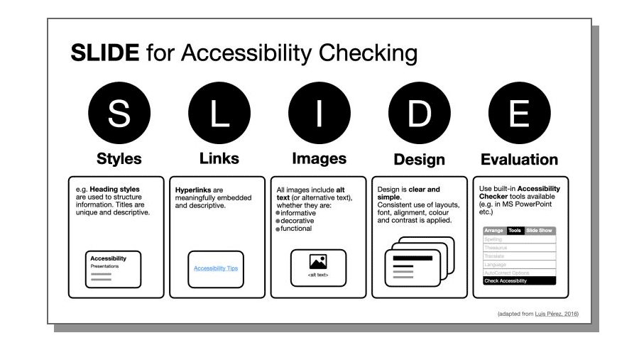
Fonts can easily make or break the aesthetic appeal of the presentation. But far more importantly, a non-suitable font can prevent some audience members from benefiting from your slides.
Here are some best practices for accessible PowerPoint fonts:
- The best font size for a PowerPoint presentation is a minimum of 24 points . It’s okay to use a bigger typeface for headings and subheads to accentuate the important information. Likewise, go for a bigger size if you anticipate presenting in a big conference room.
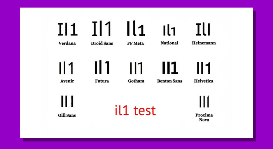
- Prioritize sans serif fonts. Sans serif fonts are those without small lines (serifs) at the ends of characters. Popular examples of sans serif fonts are Palatino, Georgia, Verdana, Tahoma, Arial, and Helvetica. Also, avoid handwritten and calligraphy-style fonts as these are the hardest to read for most people.
- Do not use flickering, flashing, and animated text. Such animations may not land well with visually impaired people or those suffering from epilepsy. In most cases, flashing fonts also make your presentation look cluttered and amateurish.
- Use bold for emphasis. When you want to highlight an important idea, use bold styling over underline and/or italics . The latter change the letter shapes, making them less identifiable, and thus less readable.
- Mark the hyperlinks. A good accessibility practice is to mark all hyperlinks are marked properly with both color and underlying for color-blind people. Also, use descriptive hyperlink texts. Otherwise, people who use screen readers will struggle to understand where the link leads.
Slide Texts
Once you’ve settled on the fonts, you’d be itching to type some presentation texts. But before (and after) you do the writing, make sure that your accessible template has the following characteristics:
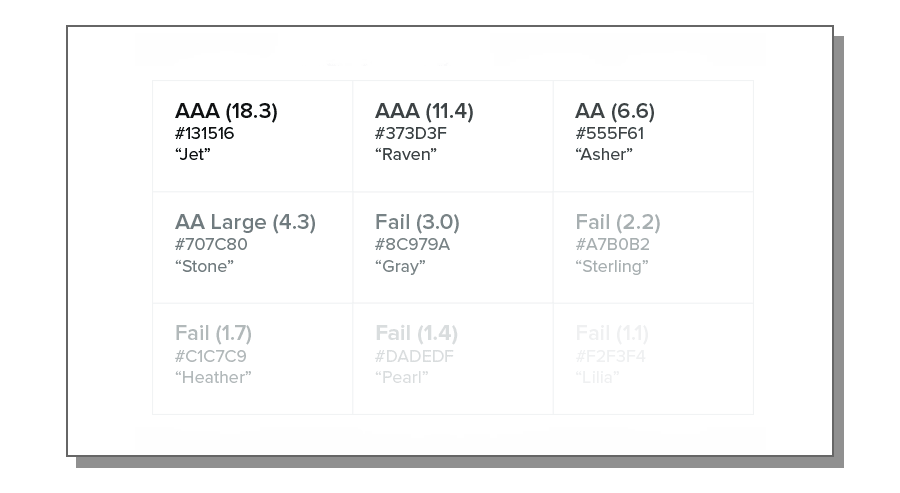
- Use strong contrast between text and background. Contrast helps visually impaired people better distinguish the characters. Use PowerPoint accessibility checker to locate insufficient color contrasts on slides. Also, check recommended color contrast values for text by WCGA.
- Go for simpler language. Don’t use jargon, industry-specific terms, acronyms, or catch-phrases. Most are not universally understood and some audience members may struggle to comprehend them. By using simpler language you are not “dumbing down” your copy — you make it more clear and concise. Add some more powerful words to make your texts more compelling.
- Check your texts for logic flow. Screen readers typically stand the text elements of the slide in the order they were added to the slide. It may be different from the order in which they actually appear. So double-check that your text flow is correct. Also, try adding ScreenTips if you are using PowerPoint.
- Don’t bottom-align slide text. Why? Because that may hide some of the bottom texts from people sitting in the last rows if the seating is tiered.
- Use captions and subtitles. Both can help audience members to better follow your delivery. Also, it’s easy to do since PowerPoint allows to automatically create real-time automatic captions for slides .
Presentation Visuals
Finally, an accessible PowerPoint template also features images everyone can understand, interpret, relate to, and process. Remember: some of the people may not see your slides well. Hence, you may need to add some extra cues for them.
Here are the essential accessibility practices for improving presentation visuals:
- Limit the use of GIFs, flashy videos or, animated transitions. Likewise, avoid shifting colors, rotating icons, and moving borders. Abusing of animations, or using too many effects and flashes in your slides can create unnecessary clutter and worsen the reading experience.
- Opt for texts over videos, when possible. If you absolutely must add a short video, ensure that the clip has good audio context for the listener to understand its content. As an alternative, add a slide note with a summary of the video clip.
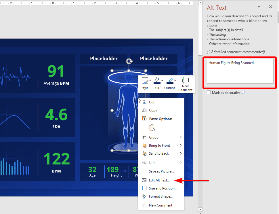
- Include Alternative Texts (Alt Texts) for visuals. An ADA compliant PowerPoint presentation has to include alt texts for all images and other visual content. Alt texts can be processed by a screen reader, meaning people with visual impairments can better understand the featured information. Adding an alt text is easy. Right-click the graphic, select Format object , then click Alt Text pane, and provide a brief text description. The same approach works for Shapes. In the example below we can see how we configured the Alt Text for a human figure in the Health Check Dashboard template .
- Highlight diverse people on your slides. Our world is wonderfully diverse. So add use inclusive visuals featuring folks of different backgrounds, ethnicities, body shapes, and abilities. In fact, that’s what most people expect from you. According to a recent Getty poll , 80% of consumers believe that businesses should show more ethnic diversity in their advertising.
- Avoid complex charts or tables. These are often hard to process for screen reading software and audience members with cognitive issues. Thus, make your graphics as simple as possible. Be careful while using SVG format. SVGs are great as they give a lot of flexibility for designing the slides and including graphics in your presentations at a minimum file size, but the format lacks semantics for expressing structures like bar charts, tables, scattered plots, etc. The above makes the content difficult to parse by a screen reader.
Presentation Delivery
When the big day of the public speech comes, don’t let your accessibility design efforts go to waste by sabotaging the delivery. Remember: accessibility is about creating an inclusive experience, not just objects. Respectively, you’ll need to adjust your delivery too. Here’s how:
Before starting the presentation, ask if there are any people with special needs in the audience. That’s a simple gesture of courtesy that goes a long way. If you see some raised hands, ask how you could adjust your speech for the person’s comfort.
Overall, speak slowly and distinctively. Use simpler language when you can, mimicking the terms you are using in the presentation copy. Don’t overload your slides with text and instead use voice to communicate and explain extra concepts. Give enough time for the audience to read the slides. Make timely pauses, allowing people to catch up with reading and processing your main points.
Keep your language more inclusive overall. Use “they” as your main pronoun when making a generalization, instead of masculine pronoun (e.g., he), or the awkward “she/he” combo. Likewise, use plural noun forms (e.g. people, workers, employees) over terms marked for masculine (e.g. foreman, fireman, etc).
When you want to introduce a hero to your story, for example, as part of a case study , go for a “gender-neutral” name such as Alex, Dana, Kim to avoid stereotyping either males or females. By all means, avoid blanket, generalistic statements in your presentation such as “Women are better cooks” or “Asians are good in STEM”. This may alienate some audience members. The Linguistic Society has a great set of guidelines for inclusive language.
Finally, consider making your slides available in other formats. While accessibility in PowerPoint is rather great, converting your slides to another format such as PDF, HTML, mp3 audio, or another type of word processing document is another great step for ensuring that more people can access your content after a live delivery.
To Conclude: Go for an ADA Compliant PowerPoint Template
Designing accessible presentations requires some effort. Making your presentations accessible means you’re considering all disabilities. If you are not sure that you’ve got all the aspects of PowerPoint ADA compliance right, consider using a premade accessible template. Accessible PowerPoint templates are fully optimized for use by people with visual impairments and other types of special needs. By opting for such a solution, you won’t have to worry about the design intricacies and have more time to hone your delivery!
Like this article? Please share
Accessibility, ADA, Diversity, Inclusivity, Presentation Tips, WCAG Filed under Presentation Ideas
Related Articles
Filed under Google Slides Tutorials • December 10th, 2024
How to Record a Presentation on Google Slides
Create powerful educational content by learning how to record a presentation on Google Slides. Ideal for webinars, lessons and more.

Filed under Business • November 21st, 2024
Employee Engagement: 6 Strategies That Work
Employee engagement is challenging to get right, but expensive to get wrong. Lack of proactive care and attention towards your team directly impacts your company’s operational effectiveness. It’s time to get proactive with employee engagement. In this article, we will review some of the employee engagement strategies that work.

Filed under Business • November 18th, 2024
Fireside Chat: How it can Effectively Replace a Conventional Presentation
Learn about a creative method to hold meetings that can allow a much more closer relation with the audience. The Fireside Chat allows innovative formats for presentations and group gatherings.
Leave a Reply

PowerPoint Accessibility
PowerPoint AccessibilityPowerPoint AccessibilityIn this guide, SensusAccess will introduce you to steps you can take to make your PowerPoint presentations accessible to most people – including people with a wide range of disabilities. Creating accessible presentations in PowerPoint is really a matter of adapting how you already work, rather than learning something completely new.
The guide will cover the following topics:
Slide Layout
Slide design, slide content, alternative text, accessible link text, accessibility checker, conversion to other formats.
Note: The following guide has been prepared using the PowerPoint version available in Office 365 on a Mac-computer (macOS).
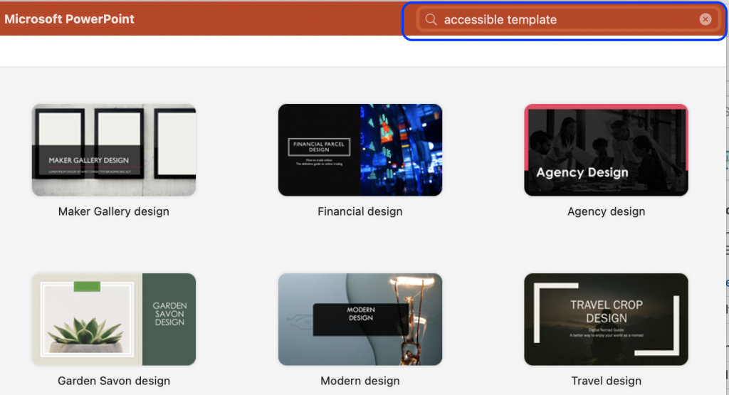
Firstly, make the work a bit easier by choosing a pre-designed template. Microsoft has a collection of their most popular accessible templates , or you can search for a template in PowerPoint by using the search field in the top right corner when opening the application.
You should not assume that the pre-designed templates found in PowerPoint are already completely accessible, but they have built-in features that can help to ensure that your presentations are more accessible.
Whether you are working in a pre-designed template or have started your presentation from scratch, PowerPoint provides you with different choices of slide layouts when you need to add new slides to the presentation.
- In order to add a pre-set slide, click on the arrow by the button New Slide from the Home tab or the Insert tab in the top ribbon.
- Pick the appropriate slide layout.
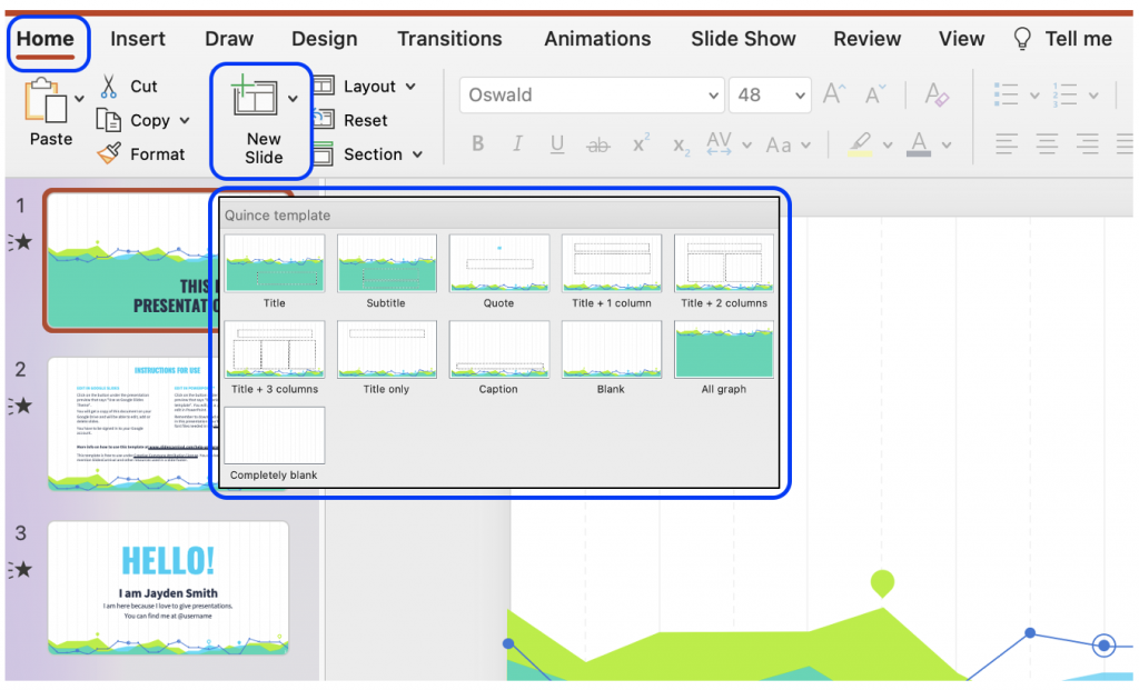
The dotted boxes on the slide layout are Placeholder Boxes . In these you can add titles, text, images, graphs, etc.
Reading Order
Users without a visual impairment usually read and view a PowerPoint slide in the order the elements appear in the slide. By default, screen reader software used by individuals with a visual impairment will first read the title of the slide, and then the software will read the elements in the order in which they were added to the slide.
The order the elements appear in and the order in which they were added may not match. To ensure the screen reader software reads the elements in the order it was intended, you should check and set the reading order.
The advantage of choosing a pre-set slide is that the reading order is already coherent with the order in which the elements are presented. Usually, at least. However, often you add new elements to the slide, or you rearrange the elements, in which cases you should make sure the reading order makes sense.
- On the Home tab, select Arrange , and click on Selection Pane .
- The Selection Pane will appear on the right side of you screen, and it will show you the order in which the elements were added. That means you should read the order from the bottom to the top in the panel.
- You can rearrange the reading order by simply clicking and dragging elements up and down. Note : In the Windows version of PowerPoint, you can also use the arrows in the pane to rearrange the order.
- To the right of each element is an icon that looks like an eye. If you click on this icon, the element will visually be hidden from the slide, but it will still be read by screen reader software.
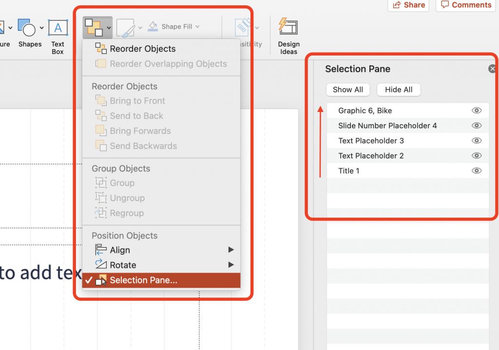
If you have chosen a pre-designed template, this comes with design elements that work together such as colours, fonts, and backgrounds. However, if you choose to make edits to these elements, you should choose accessible fonts and colours.
When it comes to text, make sure your audience is able to read everything on your slides by opting for a large font size. Keep in mind that if you give an in-person presentation, your audience in the back should be able to read the text as well.
Colour Contrast
Being able to read the text in your presentation, requires that the contrast between the colour of the text and the colour of the background is sufficient. If you have chosen an accessible template provided by Microsoft, there is a high chance that the colours in this template will have sufficient colour contrast. However, you should always make sure; especially if you are in a position where you want to change the colours.
WCAG 2.1 Success Criterion 1.4.3 specifies a contrast ratio of 4,5:1 if the font size is less than 18pt/24px (or bold and less than 14pt/18½px). Font size bigger than this requires a contrast ratio of 3:1. There are many free colour contrast checkers available online.
- To change the colour, simply highlight the problematic text.
- From the Home tab in the top ribbon, click on the arrow next to the Font Colour to open a selection of colours to choose from.
- Choose an appropriate colour and run a new colour contrast to make sure the contrast is now sufficient.
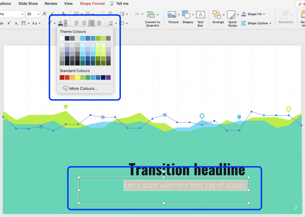
PowerPoint is a tool meant to make presentations. The application has built-in features that can make presentations more appealing, and you can present data in a way that, hopefully, captures the attention of your audience. However, some of these built-in features may not be accessible.
Slide Titles
Every slide should have meaningful and unique title. When navigating through the slides, a screen reader reads the title of the slide. If a slide does not have a title, or if more slides have identical titles, it can be difficult for users of screen readers to navigate in the presentation.
Most of the slide layouts provided by PowerPoint includes a Placeholder Box for a slide title. Choose one of these layouts and add the title.
Even if you do not want a title on the slide – if the slide simply consists of a full image – you should still make the slide accessible by then adding an invisible title. This can be done by making it invisible from the reading order.
Alternatively, if you run the Accessibility Checker it will inform you of the slides that do not contain a slide title. From the Accessibility tab, you will then have the option to insert a slide title by either having the title be existing text on the slide, new text in a new Placeholder Box , or adding a hidden slide title.
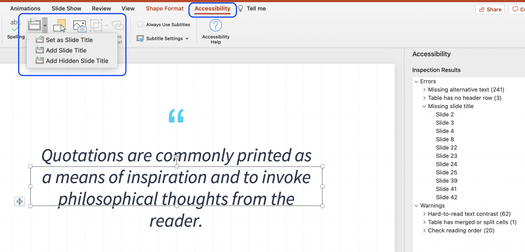
Animation and Transition
In the tabs Animations and Transitions in the top ribbon, you can choose to animate different elements on a slide as well as the transitions between different slides.
Movements on the slide or in between slides can be distracting for some users. Likewise, it may cause screen readers to re-read the slide or read the elements out of order. You should therefore consider if an animation or transition is necessary for your presentation. If you choose an animation or transition, make sure it appears or advance “ on click ” and is not automatically timed.
Remember, if your animation conveys any form of information, that same information should be available to users with visual impairments. For example, by adding captions or alt text.
Data Tables
Using tables in your presentation can be an efficient and organized way to present data. However, if these tables are not implemented correctly, they can be an accessibility challenge for users of screen readers.
A table is implemented incorrectly if it contains split cells, merged cells, nested tables, and/or unspecified column header.

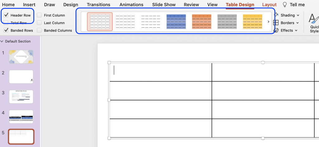
When a table is implemented correctly it is simple in its structure, the header row is specified, tables are not nested within each other, and the title is placed outside the table. Additionally, tables should be made using the correct tool in PowerPoint. Do not use the tab key to create a table, as it will only visually look like a table, but will not be accessible to users of screen readers.
- From the Insert tab, click Table and choose how many rows and columns you need.
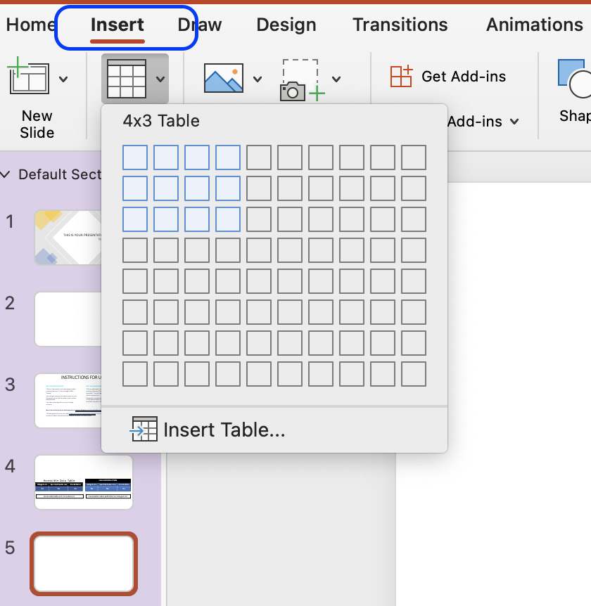
- Once the table is created, make sure that checkbox Header Row is checked in the Table Design tab.
- It is possible for you to change the design of the table, so it aligns better with the overall visual presentation.
- Keep in mind that the colours chosen for the table should have sufficient contrast. Likewise, you should not convey meaning through colour alone as users with colour blindness will not be able to understand that meaning.
Embedded Multimedia
If your presentation includes time-based media, such as a video, make sure subtitles, closed captions or video descriptions are provided.
- Subtitles contains a transcription (or a translation) of the dialogue.
- Closed captions contain, beside a transcription, descriptions of audio effects such as music or other significant sound effects.
- Video descriptions are audio-narrated descriptions of important visual elements. This type of description ensure that video content is more accessible to individuals with visual impairment.
If the video or audio is longer than 3 seconds, make sure you provide a way for the user to pause or stop the media content.
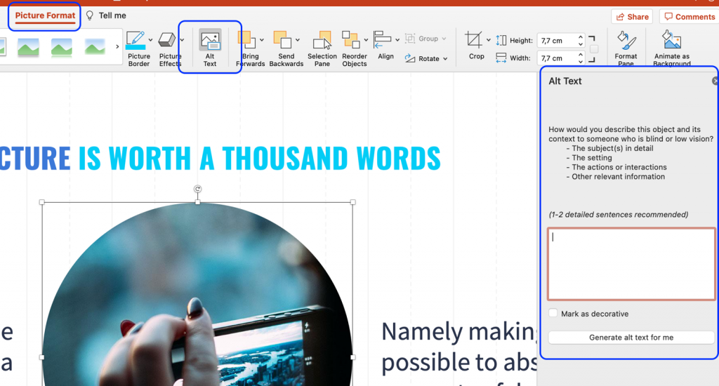
For all non-text elements in your presentation, there should be a text alternative, also known as ‘alt text’. The alt text allows users who use text-to-speech assistive technology, such as screen readers, to understand the purpose of the non-text element. These elements can be graphics, images, charts, SmartArt, icons, logos, etc.
Without these alt texts, the blind or visually impaired users may not gain access to the information of the non-text element. The descriptions should be short and communicate the main purpose of the element.
- Click on the element you want to describe with an alt text.
- Click on the tap Picture Format in the top ribbon, and then the button Alt Text. A panel appears, and you can add the alt text.
- If the graphic is purely decorative, you should instead mark it as decorative in the panel, and screen readers will then ignore the element.
Go Beyond Alternative Text
Remember, alt text is only accessible to users of screen readers, and not all users with visual impairments use a screen reader. Some rely on screen magnification. Therefore, you should check that the graphical element can be enlarged by zooming in. If the element appears pixilated, you should add descriptive captions to the graphical element.
If you plan on distributing your presentation and it contains hyperlinks to websites, other online resources, or even other slides within the presentation, make sure that the link text makes sense in its own context.
A link text makes sense in its own context if it is descriptive. Link texts such as “Read more” or “Click here” are vague and redundant. Instead, accessible hyperlinks have a descriptive text that will become the active link.
- Highlight the descriptive text, you want to be the link text.
- In the Insert tab, click on Link .
- In the pop-up window, you can insert the URL or choose a slide within the document that the text should link to.
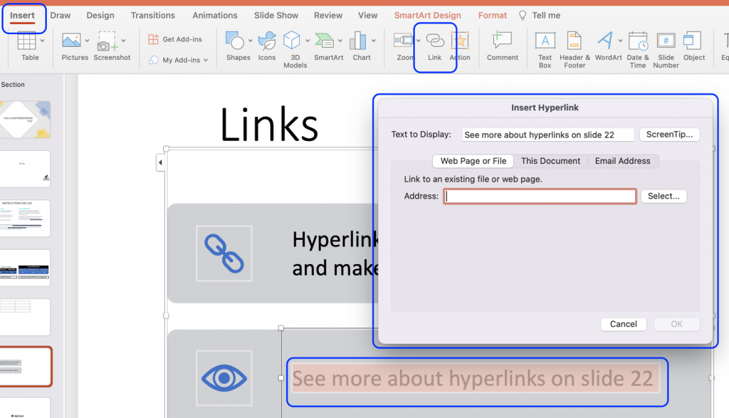
By default, the link text will now appear blue and underlined. You should ensure that the link text has sufficient contrast against the background of your slide. Remember, link text can be differentiated by colour, bold , underline , and/or italics . You cannot use colour alone to differentiate the link text from other text on the slide.
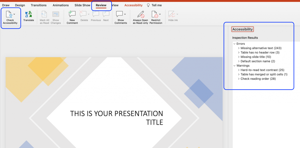
PowerPoint comes with a built-in accessibility checker. This accessibility checker can help you identify any potential accessibility problems with your presentation – including many of the issues listed in the steps above.
Although an automated accessibility checker is a great tool, do not skip on the manual check as well. An automated tool cannot detect all accessibility issues, and the build-in accessibility checker does not adhere to the WCAG 2.1 standards.
- In the Review tab, click Accessibility Checker .
- If the accessibility checker finds any issues, it will show them in a list in the right pane.
- At the bottom of the accessibility pane, the checker also provides information about how to fix the issue.
If you have followed the tips, tools, and best practised outlined above, you should have created a PowerPoint Presentation that is accessible to most people. However, PowerPoint is a software made specifically to design (visual) presentations, and it is often not the easiest format to work with for visually impaired users.
With the SensusAccess service it is possible for users to convert the PowerPoint format into something that is easier for work with. For example, a PowerPoint presentation can be converted into tagged PDF, HTML, or RTF outline. For more information on conversion possibilities with the SensusAccess service, check Module 4: Converting inaccessible and tricky documents (opens in new tab) or the SensusAccess Conversion Options .

IMAGES
VIDEO
COMMENTS
Visually scan each slide in your presentation for instances of color-coding. People who are blind, have low vision, or are colorblind might miss out on the meaning conveyed by particular colors. Use an accessible presentation template. Use built-in slide designs for inclusive reading order, colors, and more.
I've had several people ask me for tips on how to create accessible PowerPoints for audience members with print disabilities, including low vision, dyslexia, visual processing disorders, and similar, and PowerPoint has added a lot of awesome features over the years to make creating accessible presentations easier than ever.
PPTs with low vision accessibility are user friendly for everyone. PowerPoint presentations for students with low vision. APH provides information on how to create accessible PowerPoint presentations (PPT) for people with low vision. When creating a PPT, carefully consider the following things: Font; Text size (headings, subheadings, text)
Making your PowerPoint presentations accessible to visually impaired users is essential for creating an inclusive and effective communication tool. By using high contrast colors, providing alt text for images, and ensuring keyboard navigation, you can make your presentations accessible to a broader audience. Remember, accessibility isn't just ...
Lots of people who are visually impaired will be able to read your slides without using any specialist software IF you make some subtle and simple changes. Use these points when creating accessible PowerPoint presentations. Use PowerPoint's inbuilt accessibility checker. It's super easy to use and will quickly highlight accessibility issues.
To make a presentation more accessible to people with low vision, save it in an alternate format that can be read by a screen reader. Users can then open it on a personal device or port it to a Braille reader. Create a document version of a presentation. Open the PowerPoint presentation. Select File > Export > Create Handouts.
It is common to give a presentation at a conference with accompanying visuals. But what if there are individuals in the audience who are blind, have low vision, or are at a great distance from the screen so that they cannot see the visuals clearly or at all? What if there are individuals who are deaf or hard of hearing in the audience and cannot hear your presentation clearly
Welcome to a comprehensive guide on how to create an accessible PowerPoint presentation. In this guide, you'll learn the best practices for making a PowerPoint accessible and how to use the built-in accessibility checker to ensure your presentations are inclusive for all audiences. Video Guide
Accessibility in web, print, and presentation design is of paramount importance. Approximately 2.2 billion people in the world have a near or distance vision impairment. An even larger number lives with other types of visual or cognitive dysfunctions. When delivering a presentation to an audience, you never know what type of people will attend.
If you have followed the tips, tools, and best practised outlined above, you should have created a PowerPoint Presentation that is accessible to most people. However, PowerPoint is a software made specifically to design (visual) presentations, and it is often not the easiest format to work with for visually impaired users.